OK where do I start? I have been on a mission for the last decade to create poster art from my photography. Finally I am getting close!
Don’t get me wrong, I don’t think I am trying to compensate for something lacking in my pictures, I just think regular photo prints can look a little uninspiring when out of context. I am creating artworks using some of my best shots, but combining them with some of the techniques and effects used in the silk screen printing process. The idea is to produce alternative photo art that looks great hung on the wall.
McMURTRIE 2020 Photo copyright by JOHN McMURTRIE

KIRK
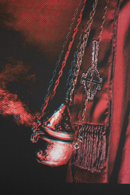
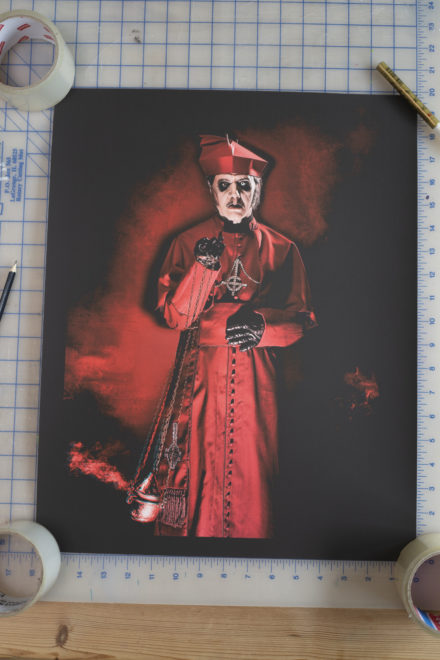
CARDINAL COPIA
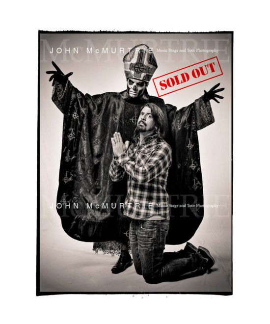
GHOST / GROHL 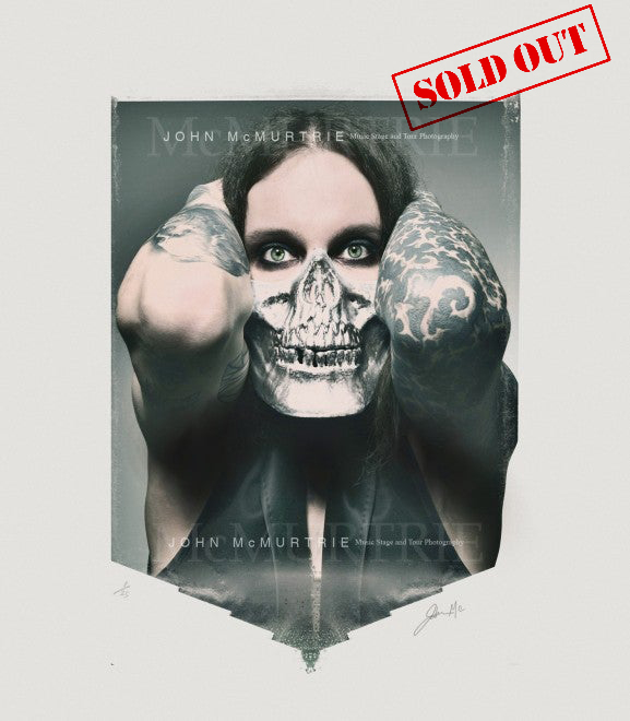
VILLE VALO / SKULL MASK
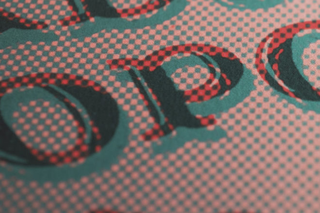
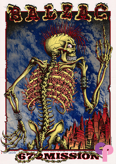
I am a fan of the poster art of Emek and Justin Hampton and have several of their artworks framed at home. It is so visually arresting, colourful and look so good on the wall. I love the saturation of their colours and the slight imperfections of out of register print. If I could apply those elements into a photographic print then I was convinced I could make something more desirable.
https://www.emek.net/index.html
http://411posters.com/tag/justin-hampton/
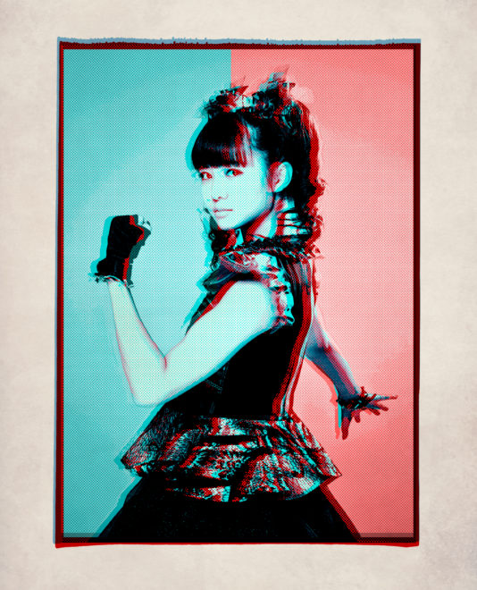
First I tried screen printing my photographs which although the colours and effects looked stunning, I just ended up ruining the photography. With screen printing you lose all the subtleties a photograph has. Even the tiniest silk screen mesh can’t display a good tonal range that is anywhere near the original photo. That said the results were good but they didn’t exactly represent me as a photographer. They looked more like a Black Flag gig flyer! What I did love was the vibrancy to the inks and the imperfections that you get from separating layers and printing tone using a dot mesh. Next I tried using some poor ‘one click’ off the shelf effects in Photoshop that just made good photography look bad. I then tried experimenting with taking each individual property within an image apart and then reconstructing the image using multiple tonal layers and colours within the RGB spectrum. On reconstruction I added half-tone to certain layers and slightly moved layers out of register. I had great results with some individual portraits of BABYMETAL which sold out incredibly fast. The feedback was unanimous and the overall poster art effect proved very popular. I named the effect ‘Tokyo Dot’ in honour of the Japanese trio and have now perfected the technique using it in various guises on some of my portraits.
BABY METAL/MOA TOKYO 2015 copyright by JOHN McMURTRIE 2015 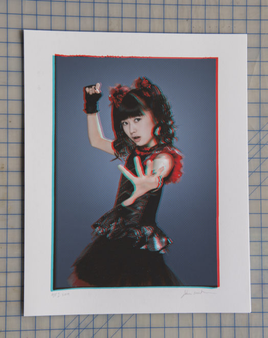
BABYMETAL/YUI TOKYO 2015 copyright by JOHN McMURTRIE
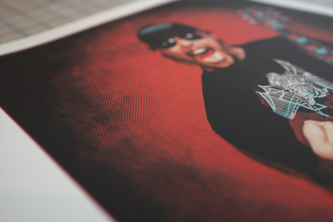
The effect used is definitely a manual technique and involves multiple hours of trial and error before an artwork is ready for print, but I adore how the artworks look. They are unique and not like anything I have seen anywhere else. They look like Silk Screen prints but don’t detract from the original photograph. They look amazing framed and stand up well as art and still have that original photograph on the wall feel.
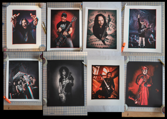
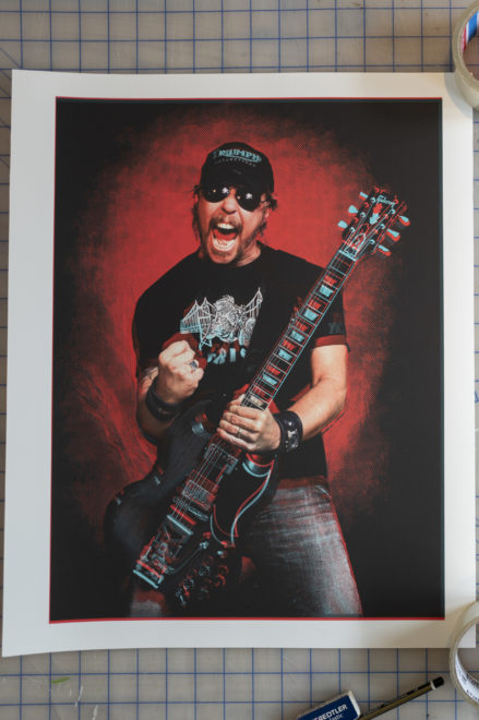
JAMES 20X16″

AVENGED SEVENFOLD 20X16″
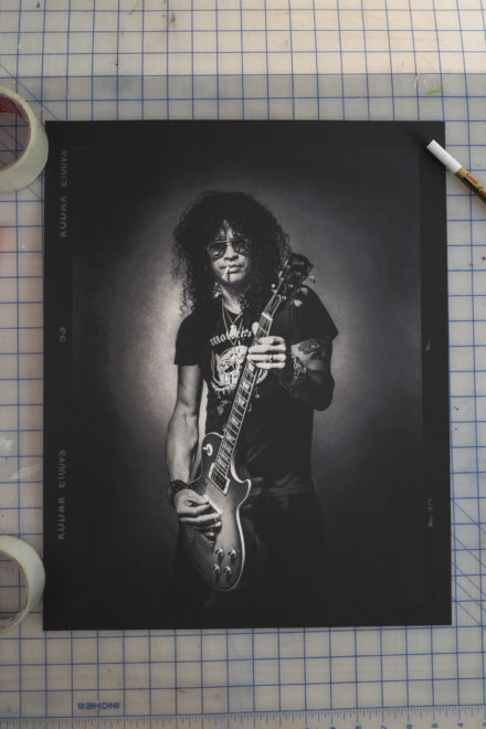
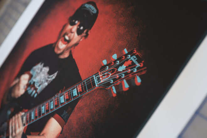
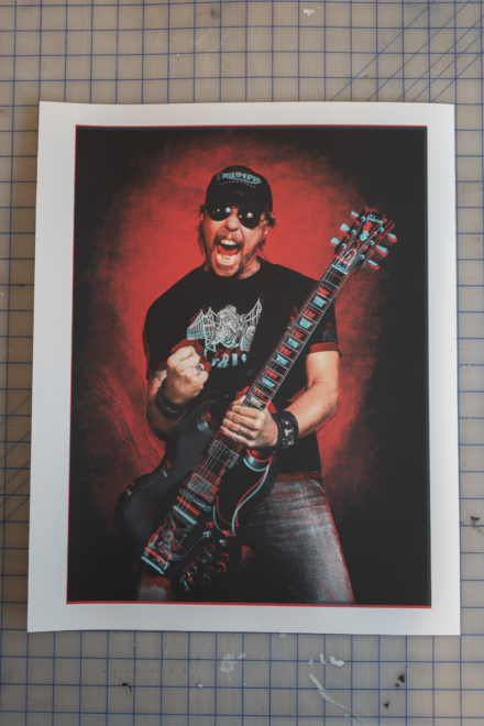
SLASH 20X16″

TONY 20X16″
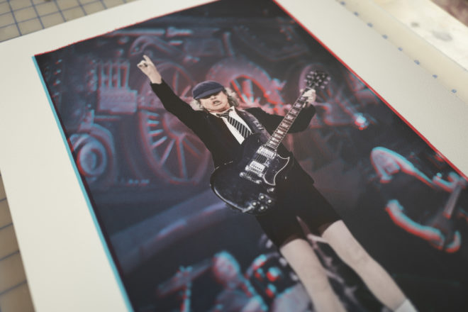
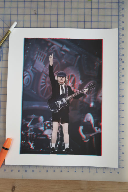
ANGUS
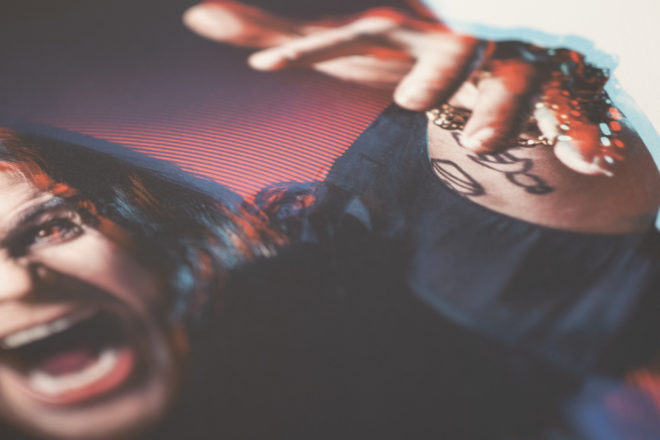
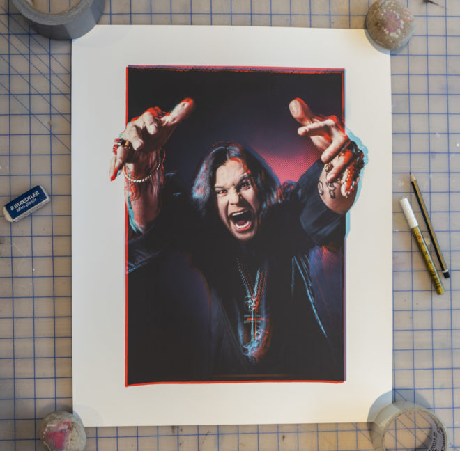
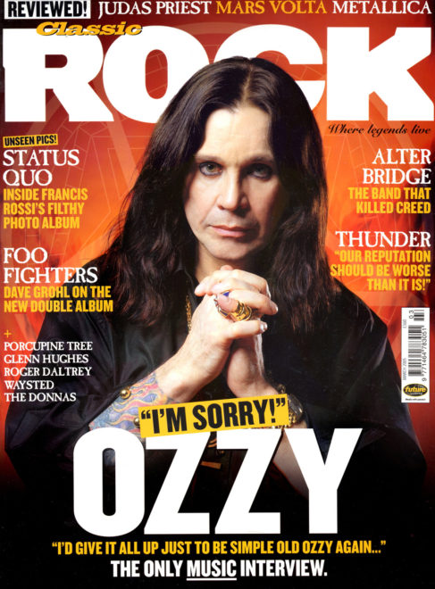
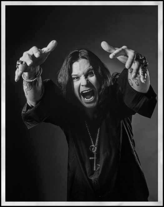
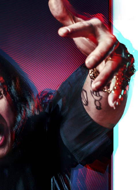
OZZY
The Ozzy Osbourne Limited Edition print was taken from an out-take from a front cover portrait shoot I did for classic Rock. It was shot in London in 2004 and my direction that day was to shoot a more under-stated Ozzy. I think the editorial angle was suggesting Ozzy was apologising for the reality TV years!
copyright JOHN McMURTRIE
Ozzy doesn’t exactly do under-stated and he is a dream to shoot, like a professional model giving you pose after pose! It was all shot on 6x7cm medium format film and all the crazy shots were cast aside in favour for a more sedate Ozzy on the cover. I recently came across the over-looked frames in my archive that contained all these amazing portraits and I knew I had to make a print.
The first step was to make a high-resolution quality digital scan from the original transparency. I then separated the image into multiple layers. Shadow detail, highlights, lowlights, Blacks are all isolated and then multiple layers are made of the RGB colours. A master layer is preserved throughout to be used to bring back detail when something is unintentionally lost. Adding a mesh dot to an isolated colour and then knocked slightly out of register creates a vibrant ghost effect when combined with the original image. I did this effect to the Red and Blue channels and added a circular mesh to the background. Areas where the integrity of the photography were compromised I painstakingly removed by hand using a pen and graphics tablet. I then re-combined the original image with the background effects and added a Sabbath inspired Purple hue. The original photograph has a lot of animation to it and Ozzy’s hands reaching out make it almost 3D. I thought it would be fun to have Ozzy overlapping the framing just to add some exaggeration to the image. The red glow in Ozzy’s eyes came from an accidental mistake whilst knocking the red channel out of register. I kept the eyes like it but preserved the tone on his face.

In all, there were 35 different saved versions before the finished artwork was complete and in total this took 5 days. If you asked me to do exactly the same effect again from scratch I probably couldn’t, it is that organic.
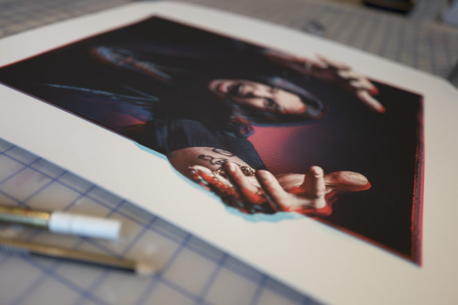
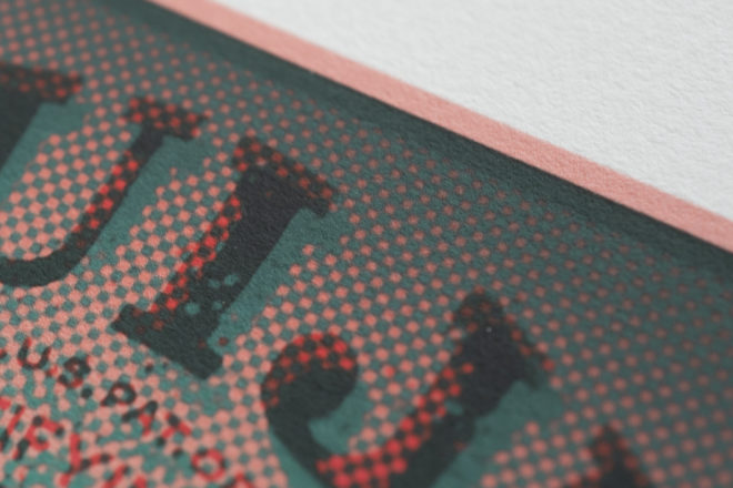
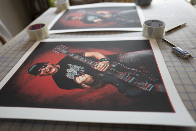
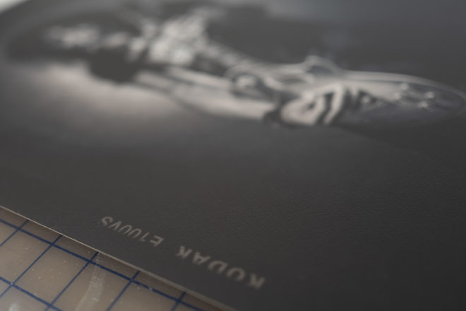
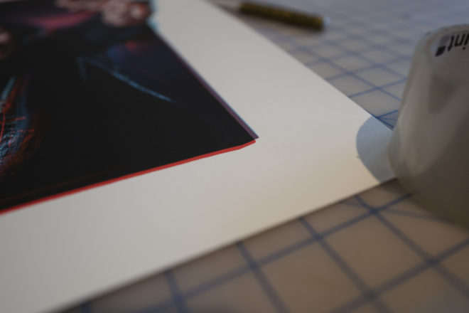
Although satisfying to complete, the next step is the laborious task of transferring what is on screen to paper. I only use 300g heavyweight 100% cotton paper for all my prints because it is the best material for printed art. The printing is GICLEE fully archival and won’t fade. The material is more like water colour paper and nothing like a normal glossy photo print. The Professional Printer I use knows me well and knows exactly the finish I want to produce. With over 30 years of experience in photo display printing Roo@Kangarooz brings a wealth of knowledge and good advise each time we produce a Limited Edition print together. Firstly the screen RGB original is converted into a CMYK file that matches the printers profile. This is a delicate stage which often requires adjustment to each individual colour to create the vibrance found in Silk Screen printing. 8 inks are used in the printing process. Several small versions are run off at different settings and once approved a large format 20â€x16†is made which I then take away to check in different light conditions. Often a print under the bright daylight illumination of the studio can look very different when viewed in tungsten or low light. Normally a few changes are made to the density and saturation of the first print and then the A/P (artist proof) print is made and this is what is used as reference for the run of 50 Limited Edition prints. Once happy and everything is approved the studio then begin the print run and each print is trimmed by hand. I then personally sign and number each print and they are placed between acid free tissue paper. Each print goes out with a simple Certificate of Authenticity detailing the individual number in the edition and its prominence. From start to finish the Ozzy Osbourne Edition has taken nearly a whole month of design and printing.

All the prints are part of a strictly Limited Edition of 50. The print run is independently verified, all prints are hand signed and numbered by John McMurtrie. Once gone, they are gone!
JAMES OZZY 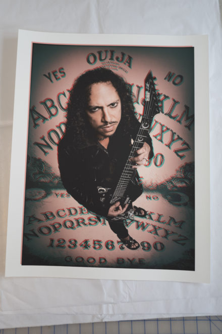
KIRK 
ANGUS 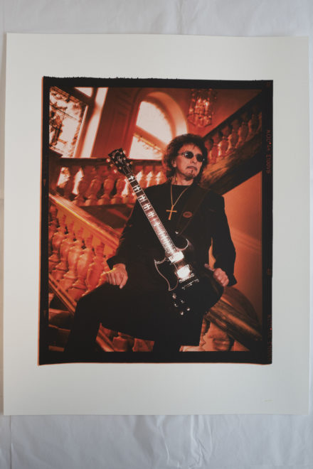
TONY 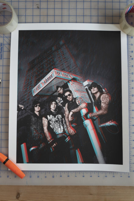
A7X 
the Cardinal 
SLASH